Brimar Industries, Inc.
SafetySigns.com
SafetySigns.com was looking to update their header and footer to the website and also have their product page redesigned.
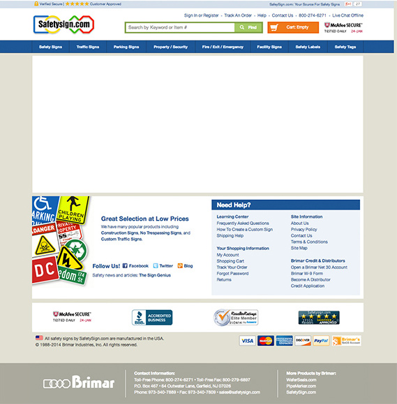
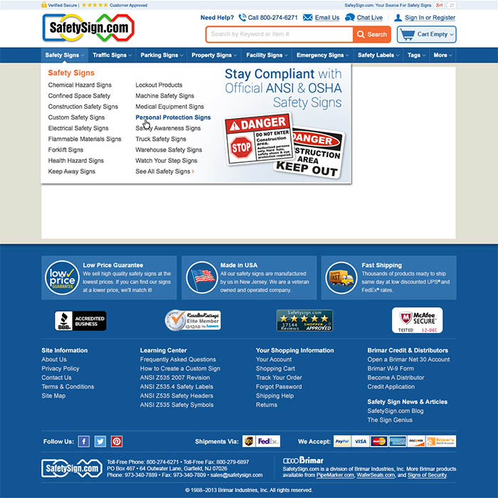
The navigation bar in the header did not have drop down menus so I redesigned the site to incorporate the menus that way a person will be able to navigate through the website more easily. Within the header, I also updated the shopping cart information, the "sign in or register" look (adding a drop down once the user signs in) and added icons for the contact info.
I felt that the footer of the website looked disjointed and it wasn't obvious that the information on the bottom was on every page. I added a blue background to help anchor the footer info on the bottom of the page and reorganized and added additional information. After researching what the benefits were for buying products with this company, I felt that the low pricing guarantee and same day shipping info needed to be added to the page to remind the customer of the benefits of buying from this website as opposed to any competitors site. Also, the company takes pride in being an American company, so that was also added to the footer.
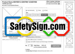
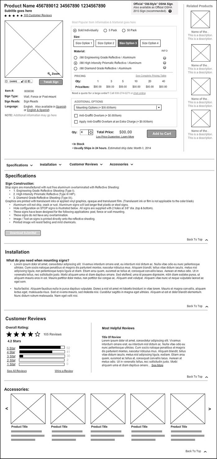
The SafetySigns.com product page looked a bit overwhelming, so I created a wireframe using Mockflow to create a more organized structure for the website. I researched competitor website and also fashion & home-good websites to help inspire this wireframe design.
In order to make this page work, I utilized the entire web width (eliminating the navigation on the left side). I shortened the product selection information by creating a step by step process for the user to select product details they desired. I also added an “information” button next to the material so that the user can know the difference up front rather than searching for the differences. The original web page listed all the sizes and materials that the sign came in which made the web page extremely long. The user had to scroll down the page and click a tab in order to learn more about the material details. I also added a "most popular product" to the page that way if a user is unsure what they should get, they get an idea of what is most used.
The product page also had an extremely long accessory section. I felt that this information was secondary to what the actual product so I moved it to the bottom of the page, and shortened the accessory information.
I know that the wireframe that I designed is the best solution to include all the information that the business wants and has the best user experience for customers while they are selecting a product.
