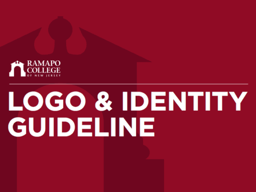
Ramapo College Logo & Identity Guideline
While working at Ramapo College, I was tasked with updating flaws within the Ramapo College logo and updating the design guideline to help further extend the Ramapo College brand in Marketing/Communication materials, and to help define different logo options for logo requests within different departments within the College.
The Problem
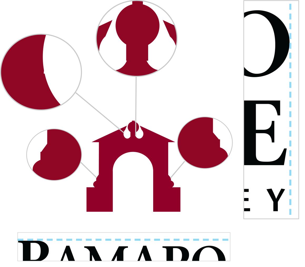
The old logo has some imperfections within the Arch symbol which was an issue in large format projects. The Arch symbol was not symmetrical. There were also text alignment issues in the wordmark/text portion of the logo.
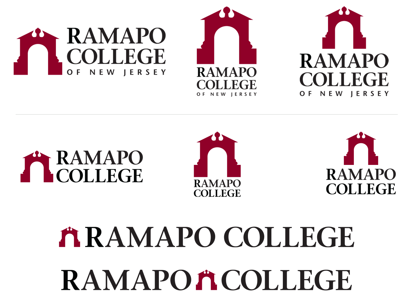
There were only two different options for the logo which made it hard to work with in smaller and thinner marketing material (example pens).

Departments within the College were requesting completely custom logos that did not reflect the Ramapo College brand.
The Solution
Logo Updates:
I corrected the flaws of the logo, making sure that the Arch symbol was symmetrical. Additional space was added on each side of the peak of the arch to allow better visibility in smaller formats. The Arch symbol was updated and the “R” in Ramapo is now flush with the rest of the letters.

Old version of the logo

Updated version of the logo
Also, I proposed creating different versions of the logo and defined when and how these versions should be used.
Arch as Art:
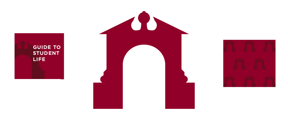
I proposed allowing the Arch symbol to be utilized as a stand alone icon separate from the rest of the logo, defining how to correctly display this icon as a design element to adhere to brand standards.
Tiered System:
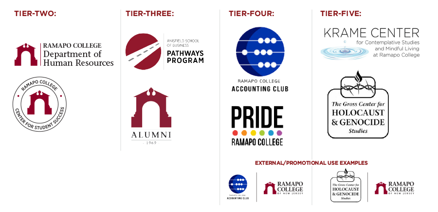
Also, I created a logo tier system and established guidelines for this tier system to help with standardizing the brand, defining design elements usage and to clarify options for logo requests within the College.
View Proposal
(PDF)
View Update Guideline
(PDF)
